Create Beautiful Instagram Feed Widgets with Grace
Widgets are truly versatile tools to create unique, useful and beautiful elements for sidebars or footers of your WordPress website. The advantages of widgets include the ease of embedding and vast opportunities to customize their appearance. Widgets help to make your WordPress website more engaging through interactive elements, such as automatically updated Instagram feed gallery on your sidebar, footer or single page.
Grace Instagram Feed Gallery plugin provides ample opportunities to create, customize and add widgets with automatically updated Instagram photos for your WordPress website or blog. These opportunities are available due to simple fine-tuning the appearance of your Instagram social streams through Layout tab of the Grace plugin`s menu.
Today we will consider the most interesting and simple ways to create Instagram Feed Gallery available for using as a WordPress widget. It is amazing that can create and customize Instagram photo gallery by means of Grace in a matter of minutes. Furthermore you can choose the most suitable way to display the gallery in order to fit the overall website style.
3 Types of Instagram Feed Widgets
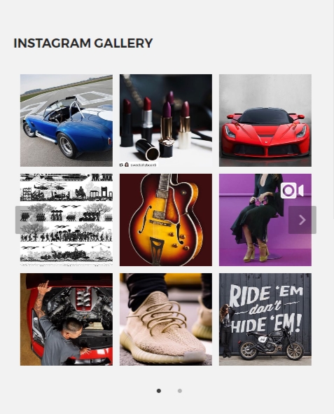
3 types of Instagram Feed Widgets are: compact grid gallery widget, single row slider and single post slider.
The example of Compact grid can be seen within the gallery with 9 Instagram posts in the form of 3 rows and 3 columns (you can also create your own variation with any number of columns and rows):
Single row slider is the gallery with one row and the number of columns you wish to display:
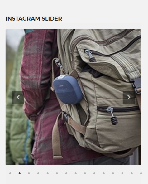
Single post slider is just one image adjusted to the height and width of the widget, but users can slide through the other images by clicking on the widget area:
In all cases the size of the photos will automatically adjust to the width of the widget block you are using. Now we will look at the simple techniques of creating each of these Instagram feeds. But first of all we expect you to have at least one available Instagram social stream with Grace. If you do not know how to work with Grace or have no clue about its capabilities, than we suggest you to read the introductory article about the plugin.
Creating Compact Grid Gallery
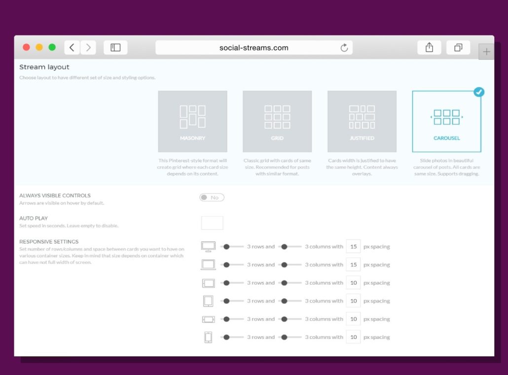
Find the Layout tab on the preferences of your stream: go to Social Apps — Grace Instagram on your WordPress admin panel, proceed to Streams tab and click on pencil icon to edit the stream. Choose the Carousel stream layout option and change the Responsive Settings under it. You should choose 3 rows and 3 columns options for every device. The adequate spacing is also very important. We advice to enter 15px spacing for PC and notebook devices and 10px for other (mobile) devices. Do not forget to save changes by means of the green button.
The other important feature is a hover effect. It appears to be ugly for minimized images to display the additional information about the Instagram post by means of hover effect, which is applied by default. To deal with this problem you should copy the following code and paste it to the CSS tab of the stream:
.ff-overlay-wrapper {
display: none;
}
After that the hover effect will not further occur and your widget gallery becomes really beautiful!
Creating Single Row Slider
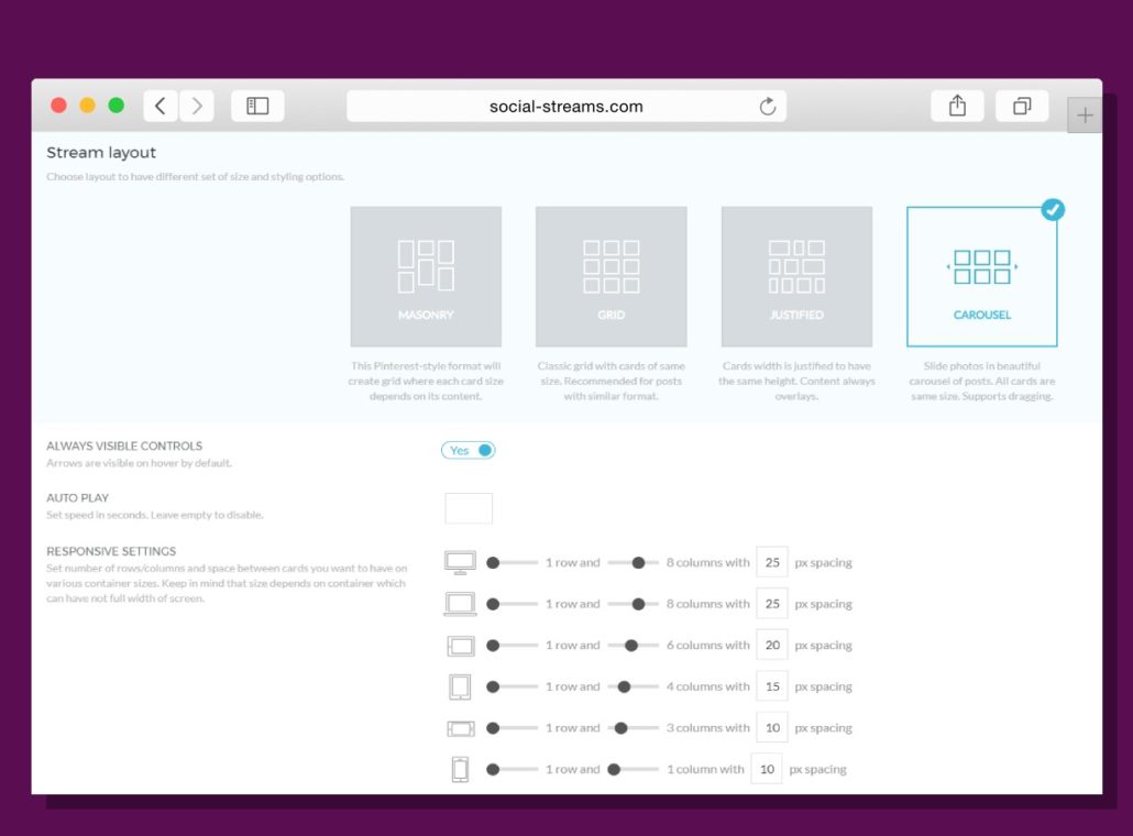
The same Layout tab is used to create Single Row Slider. We will also use Carousel stream layout option. But this time we will apply another Responsive Settings: one row for every device type and different amount of columns corresponding to the device type. The exact choice of columns` amount should be done in the basis of your own WordPress website design. Our common advice will include: 8 columns for PC and notebook, 6 columns for horizontal tablet layout, 4 columns for vertical tablet layout, 3 columns for horizontal smartphone layout, 1 column for vertical smartphone layout.
The spacing options should also be determined by the peculiarities of your website`s design. The average parameter values will differ corresponding to the device types in such a way: 25px spacing for PC and notebooks, 20px spacing for horizontal tablet layout, 15px spacing for vertical tablet layout, 10px spacing for both horizontal and vertical smartphone layout.
The advice about deleting hover effects is also useful for this type of Instagram feed widget. Use the simple code from the previous part of the article within the CSS tab.
Creating Single Post Slider
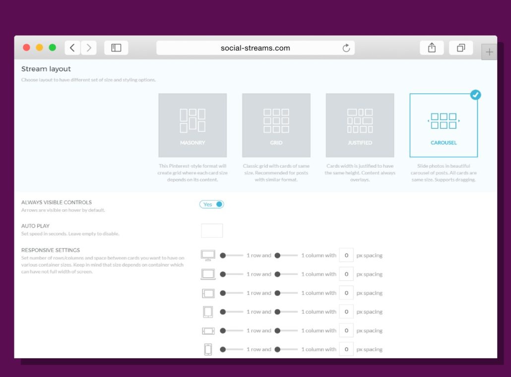
Single Post Slider must be the easiest way to create Instagram feed widget on your WordPress website. And it truly is! First step on the Layout tab is similar — you are choosing the carousel slider layout type. Then you should set all the Responsive Settings for rows and columns to 1 (for all device types). It is done!
Hover effect can be left unchanged for this type of Instagram feed widget, as the width and height of the images will allow to display additional information about the post in an adequate way. But whenever you want to get rid of the hover effect, the code above is for your service through the CSS tab.
How to Add Grace Instagram Feed Widget
To add Grace Instagram feed widget for any part of your WordPress website you should find the Appearance menu within the admin panel and choose the Widgets subcategory. There you will see the full list of available widgets for your WordPress website. Find Grace Widget entry (you can use ctrl+F combination for quick search within your browser) add drag-n-drop it to the right widget area.
You can also add a widget by means of special Grace element within the Visual Composer interface. This method is also very simple: you add the Grace element and choose the prepared stream in the elemeny`s options.
After that you should choose the appropriate stream from your list and write some title for the widget. That was the last step — now you have the automatically updated Instagram feed gallery inside your WordPress widget!
Conclusion
As you can see, creating Instagram feed gallery widget is pretty simple and fast-to-go process. With this knowledge of Grace features you can easily decorate your WordPress website or blog with any of the above mentioned widgets to make it more vivid and interactive. Have fun!


